Monday, May 30, 2011

office desk comparisons, by berinder purewal

Theres a wide range of office desks to choose from, big or small with shelves or without shelves.It all depends on your office/workplace.Working in accounting offices which would probably have plain,simple small desks differs alot from working in a stylish fashion office where you may have more space and a sleek design.
This is a great example of a efficent way to use small desks.To many big desks in a office can make it look cluttered and crowded.This is a benefit of a small desk,they take up less room and make the room look neat.A con about smaller desks is that they have less storage,so objects may be stored on top of the desk making it look cluttered.

These two desks are bigger but have much more storage then the other little desks.These kind of desks make the room look fuller and you can store way more.In the first picture the whole unit is attached with shelves and cupboards in the second picture the storage shelves are behind the desk.I like the first option better it would work good in  a corner while the second desk would work great if it was centered.Desks can be made out of all kinds of materials from wood to metals.Some cons about bigger desks are they do take up alot of room and if you have a smaller office I don't think these desks would be a good option although you can get smaller ones similiar to these.When choosing a desk for your office it all depends on the room and size every desk is different.


organizational system: storage boxes, by berinder purewal

Storage Boxes Storage Boxes

I chose to write about storage boxes.They can be used to store anything from toys to paperwork. They come in many different colours,shapes & sizes.They can be stored anywhere, in your closet, under your bed, & on shelves.What's really great about storage boxes are they are very easy to find at department stores, dollar stores,and home decoration stores.The price range varies, the in first image I have shown you can buy this really cute printed box at ikea for about $3.99 - $6.99.This is good deal for such a easy and neat storage piece.The second image I think would work great in your living room,the leather storage boxes are a bit more expensive but I think are worth it and they may last a bit longer.The third image is a metal box, they are much sturdier and would break less easily.These would be perfect for the office.I don't really think there is a big con about these boxes but I think it could get confusing if you have a lot of the same boxes so putting labels on the front would make it much easier!

Saturday, May 21, 2011

la terrazza restaurant


The restaurant I chose to do was La Terrazza in Yaletown.It has a very warm feel to it.It seems warm and inviting.I like the neutral theme with the pops of green in the drapery and in the ceiling.I personally don't really like the drapes hanging from the ceiling, I think they are there to cover up the pipes above,but they do give the ceiling a unique look.The room has a very elegant overall feel to it.
The lighting of the restaurant is pretty dim,I like the large light fixtures.
I think the dark hardwood floors really tie the room together and similar wood is used on the chairs and the doors by the wine.There are similar smaller light fixtures by the wine.The ceiling by the wine holder is super cool, it seems to use the same color drapes that are hanging above dining area and the same colour green that is painted on the ceiling in the dining area.It has a weaved pattern  which is reall unique to have a on a celing. I think commercial design is different than residential design because in a commercial area you need to have more furniture and decorative items and usually commerical areas are much larger areas to work with and you need to make sure everything flows well together.

By Berinder Purewal

the roosevelt hotel new york


The hotel I chose to write about is the Roosevelt Hotel in New York.It was opened 1924 and has been standing strong ever since.The hotel occupies a full block of real estate in the trendy Midtown East neighborhood of Manhattan.I liked this hotel because it's very elegant using golds and neutral colours throughout the hotel.


The lobby has a very elegant feel, with the sparkling chandliers,coffered ceilings and white marble floors. I love the gold trimming and details in the ceiling.The curtains and drapery look great with the neutral theme.The pastel green chairs also add a pop of colour.One thing I don't like is the big plant as the center piece,I think would look better just plain.

The bedrooms have the neutral theme going similar to the lobby but without using
as much gold.There are pops of brown in the chair and the curtains.The art work uses red
and there is a gold trimming which is very similar to the lobby.This room uses white flowers
instead in the lobby with green I think the white flowers would also work better in the lobby.


The restaurant as you can see is following the same trend that is going through the whole hotel,neutral theme with gold & red.The red carpet and drapery is very similar to the lobby.Im not a big fan of this restaurant, I think it looks kind of boring/plain.I think they should have used different chairs, ones with upholstery matching the chairs in the lobby.

Thursday, May 19, 2011

office desks comparison

 there are a lot of different types of desk. depending on the environment of the office. desks for a stylish fashion company might have more design than a desk at a dull accounting company. desks can be as simple as just a table or as a unit itself. personally, i prefer the bigger desks with more shelves and cupboards. i think it looks fuller and would be great in a one desk office. having too many big desks in a workspace can make it very crowded. the benefits of having a smaller desk is that it doesn't take up much space and the office wouldn't look cluttered but at the same time there aren't that much space for storage. also with smaller desks, papers may be left on top and would look messy rather than having it in folders and shelves. bigger desks on the other hand are the opposite. they take up more room but have more storage. i think it just depends on the space and feeling of the office itself to determine which type of desk would be suitable. desks can be made from different material from wood, metal to different mixes of materials.

vicky hong

organizational system

i chose the shoe organizers because it can be used in many different places in the house. It is very organized because it has many different pockets for different things. from using it in the kitchen maybe using it to store different cleaning supplies to the garden with storing different types of seed or garden tools. it is also easy to use because if you're trying to find something you can skim through each pocket instead of opening boxes or bags. using these shoe organizers will also save a lot of space because it hangs on the back of doors. everything is out on the open but not in a messy way. everything has its place but is not hidden away. i think these are very useful and practical.

vicky hong

restaurant


the restaurant i picked was Blue Water Cafe located in Yaletown.  it has a beautiful patio for the summer and an elegant interior. it uses dark rich colours like brown, black and red. it also has an old fashioned feel to it in a modern way. the lighting is quite dim but bright enough for the restaurant to function. the texture and vibe of the room is very soft and warm. accents of blue are found in small portions around the restaurant from the lighting, plating and bits of painting on the wall. all the wine on the wall also completes the restaurant. it fills the walls up instead of having murals and pictures. personally, i think without covering the ceiling makes the restaurant look better. using just a dark colour so that the ceiling is not center of attention but all the pipes blend in with each other. using a ceiling to cover  would make the restaurant feel more closed in. i think commercial design is different than residential design because there are more items and furnitures in a commercial area. everything has to go together without being crowded and too busy.

 vicky hong

hotel; vicky hong

v

the hotel i chose to write about was the Four Season Hotel in Hong Kong. I thought that design for the hotel was very modern and elegant. It was built in 2005 and overlooks Victoria Harbour and the financial district. It is a 5star hotel that has about 400 rooms.

i think that the design for the restaurant and dining room and very elegant. The dark rich colours make it feel warm and cozy. The big chandeliers work really well with the dark colours creating that environment. A lot of details are a great touch, including the small lights at each table. they act as a little centre piece along with the flowers int he dining room.


 I also love the bold but chic design of the bars and bedrooms. all the colours go really well with each other. The different shades of the blue in the bar really defines the place. it stands out but is not overwhelming. the bedroom has neutral and dark colours making it very warm. there are a lot of sharp squared accessories to the room that make it contemporary modern.


pillows


i think that pillows can make a difference in the overall appearance of a room whether it be the bedroom or living room. pillows add that extra bit of vibe or 'oomph' that a room needs. it can be the accented piece of the room that can easily be added and changed. there are many different designs out there and many different prices for them. the prices of pillows vary between 20 dollars to even the hundreds. it can be the inspirational piece and be eye catching or it can blend in and just make the room more welcoming and less empty. pillows also even and balance out the room. if the room is already filled with designs and is busy then simple one coloured pillows would be perfect. and if the room is simple, abstract patterns on pillows will even out the room so that it is not boring.


vicky hong

favourite colour


i find white my favourite colour to work with. it's a neutral colour that can fit with any other colours from dark to bright and pale colours. i found out that there are also different shades of white not just one. there are some creamed coloured ones. I think white is one of the colours that can work for anything, it  can be modern, elegant or chic. personally, i find white very calming and bright. it brings joy and makes me happy although it's also plain. on the other hand, when put with darker colours, it can be a very warm and welcoming colour. like in the fashion industry,white doesn't and will never be out of style.

vicky hong

environmentally friendly flooring

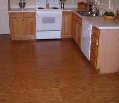
the environmentally flooring i found was cork flooring. it is made up of the outside layer of the cork oak tree. when the bark is taken, the tree grows new barks and this process does not harm or kill the trees. bark of the trees are sliced out to make flooring. there are a lot of benefits to using cork as flooring. it is light, elastic, impermeable and has low conductivity. the cons of having cork flooring is, it can easily be damaged with heavy objects. it will also fade after time because it is natural and will fade because of the sun.


vicky hong

least favourite colour

my least favourite colour to work with is grey. i think it's a very dull colour.and unlike white it is hard to match with a lot of colours even though it is a neutral colour. other designs i've seen with grey are usually matched with itself. it's usually just different shades of grey in one room.


i find it hard to add more colours into these designs. like the above design, there are only bits of neutral colours and a bit of accented yellow. although, i like the black fading of the wall behind the tv. it has the faded black which is like grey. i find that creative and modern looking.

interior blog

the blog i chose was Breathe Modern at LateMag. the blog is simple and is very easy to follow. it features designs that are very modern. it shows different designs of furnitures and also styles. it is a branch about interior from LateMag, who has things from music to films. i like this blog because it's not too much and is easy to follow. there's a caption for each piece underneath with their opinion about it. this site has been running since 2009. there's nothing i dislike about it because it's clear and simple. the designs aren't outdated and can be added in different scenes. it stood out to me because it was simple, a lot of the other blogs i checked were hard to follow and had too much unnecessary information.


the product i liked the most on this blog was this chair that could be turned into a table. the design is very modern and it's practical. i found it cool how it was designed and how you can sit on it as a chair ot turn it into a table for your computer. i would love to buy a table like this one !


http://latemag.com/modern/

vicky hong

blog about a blog - by berinder purewal

My favourite blog is CocoCozy.The author,Coco is based in Los Angeles.It has a simple layout to follow and is great for anyone just beginning with interior design.It covers a nice variety of styles.This blog covers a number of rooms from bedrooms,bathrooms,livingrooms's etc.The person running this blog also has a shop where you can buy anything from curtains to candles.Some of the items are a bit pricey but very cute!
My favourite item sold on the blog are these pillows
Gate (Black)Quatrefoil (Black)
I think these are really simple and cute pillows that would go great on white couches!
I wouldn't change anything about this blog it has a very simple layout which is super easy to follow.I personally love the designs and rooms she posts.I love the bloggers input on all the stuff she likes and doesnt and what in her opinion works or doesnt.She also shows alot of rooms designed by other designers which I think is great and i love seeing their work.I definately reccomend you to check it out! here's the link
http://www.cococozy.com/

By: Berinder Purewal

Wednesday, May 18, 2011

organic fabrics, by berinder purewal

Going Green is a big trend in a lot of areas, especially in interior design.Organic fabrics are great to have in your home, they help out the planet and also create a healthier atmosphere in your house.They vary from bed spreads,towels, drapes etc.Organic fabrics are grown without any chemicals unlike non-organic fabrics which have toxins.Organic fabrics like alpaca wool are really durable, and they let  you to use and throw them in the laundry time after time without worry.There stronger than anything synthetic.Alpaca wool feels luxurious and will keeps you warm.
This is an example of some ogranic cotton towels which you can buy in all of the natural, earthy colours.They look much like normal towels but by buying these they are great for the environment!

 Organic cotton drapes are a great for people that are concerned about the environment,and people with allergies, asthma.They look great too and you can get them in many colours,this is defitnately a good investment.

This is a cute example of organic bedding.It is durable and longlasting.Buying organic cotton bedding will benefit your health and it gives you a chance to contribute a positive impact to the environment.

By: Berinder Purewal

Tuesday, May 17, 2011

least favourite colour, by berinder purewal

My least favourite colour used in rooms is this colour that looks kind of like throw up green(sorry don't know how else to describe it).In my opinion it just looks so bad painted in all the walls of a room.Although I do really like pastel green paired with white, I really don't like this shade of green.
.


This room uses lots of this green colour.It's just not a very appealing colour and I would never want it my house.Its looks kind of over whelming in this room with the green walls and couches.I think this would work better with white couches and green pillows.The carpet also look a bit crazy I think maybe hardwood floors would look better with this room.


I don't even know where to start.This room looks like it was designed by a kid.Theres so many colours and in my opinion they don't go.I would never want my kitchen this colour or any of these colours it defitnately would not be an appealing place to eat everyday.


This I think is a good way to use this green colour,as a accent.In this room the green doesnt overwhelm you but adds a nice touch of colour.It goes really well with the black head board and lamp.I love all the  pillows and how they have green polka dots and circles and also incorperate black.

By: Berinder Purewal